top of page
Food Truck Mobile Ordering App
High-fidelity prototype that provides a fast, joyful mobile ordering experience for a beloved University City food truck

Overview
KC's Fresh Fruit and Smoothies is a beloved University City food truck with a loyal student following — and no digital presence. Over the course of ten weeks, I collaborated with a team of four UX design students to design a mobile ordering application from scratch, guided by on-the-ground research and three rounds of usability testing.
Our process involved analyzing the business and its competitors, conducting user research, and iterating on designs based on data-driven insights. The result was a high-fidelity prototype that matched the speed and personality of KC’s business, giving students a seamless, joyful way to order ahead.
The Team
-
5 UX Design Students
-
1 Client
Tools
-
Figma
-
FigJam
My Role
-
UX Researcher
-
UX/UI Designer
Primary Contributions:
-
Visited KC's food truck to experience the customer journey firsthand and map out the task flow
-
Conducted fly-on-the-wall observations, customer interviews, and usability testing
-
Designed and iterated on low- to high-fidelity designs for the core ordering flow
-
Proposed and facilitated an action-oriented design session that unblocked the team during mid-fidelity iteration
The Problem
KC's had no app, no website, and a minimal social media presence, yet consistently drew a crowd of students between classes. With no way to order ahead or browse the menu, we sought to improve the user experience before customers even walked up to the truck. This project focused on the customer-facing ordering experience, rather than the business side of order fulfillment.
Goals and Objectives
-
Produce designs that accurately reflected KC's brand and personality
-
Design a fast, minimal ordering flow tailored to the "grab and go" nature of the experience
-
Develop a fully functioning high-fidelity prototype validated through usability testing
The Process
Experiencing the Customer Journey
To get started, we needed to understand KC's business operations, competitors, and customers. I visited the food truck to experience the customer journey firsthand. Using the insights I gathered, I created a task flow to share with the group, detailing the interactions between KC and her customers along with key decision points.
The task flow highlighted the straightforward process of placing an order, as well as KC’s methods for fulfilling both smoothie and non-smoothie orders. It also revealed differences in ease and efficiency between the two payment options, Venmo and cash, during the order handoff. While Venmo users paid immediately after ordering and exited quickly, cash customers typically paid after receiving their order. This was a small, but meaningful observation that informed the simple workflow we wanted to build into the app.

Customer and Business Task Flow
Observing and Interviewing
Over the next two weeks, our team conducted individual explorations of KC’s food truck. During the first week, we conducted a fly-on-the-wall exercise to observe customer interactions. In the second week, we approached customers while they waited for their orders and conducted brief interviews. Collectively, we observed 16 customers and interviewed an additional 10.
Key findings:
-
81% of customers were college students
-
75% ordered immediately; most already knew what they wanted before reaching the window
Across 16 observed customers, the order handoff was consistently positive; customers smiled, exchanged thanks, and left quickly. These findings sharpened our focus: the in-person experience was already fast and warm. Our job was to build something equally frictionless for the moments before customers arrived.
Customer interviews reinforced this direction. Returning customers cited KC’s personality as a primary reason they came back, while both new and returning customers described the ordering experience as fast and easy. Interviews also revealed frustrations with the current payment experience. One customer expressed a desire for an Apple Pay option, saying they “use it to pay at other places and it’s really convenient because you don’t even have to open your phone.”
The owner is really nice and her smoothies are really good.
Customer Interview Participant
Identifying the Target Audience
With our target user clearly defined, we built our primary persona around a loyal Drexel student who values simplicity and efficiency. He arrives with a plan; he just needs a frictionless way to execute it.

User Persona for a KC's Customer
Market Positioning
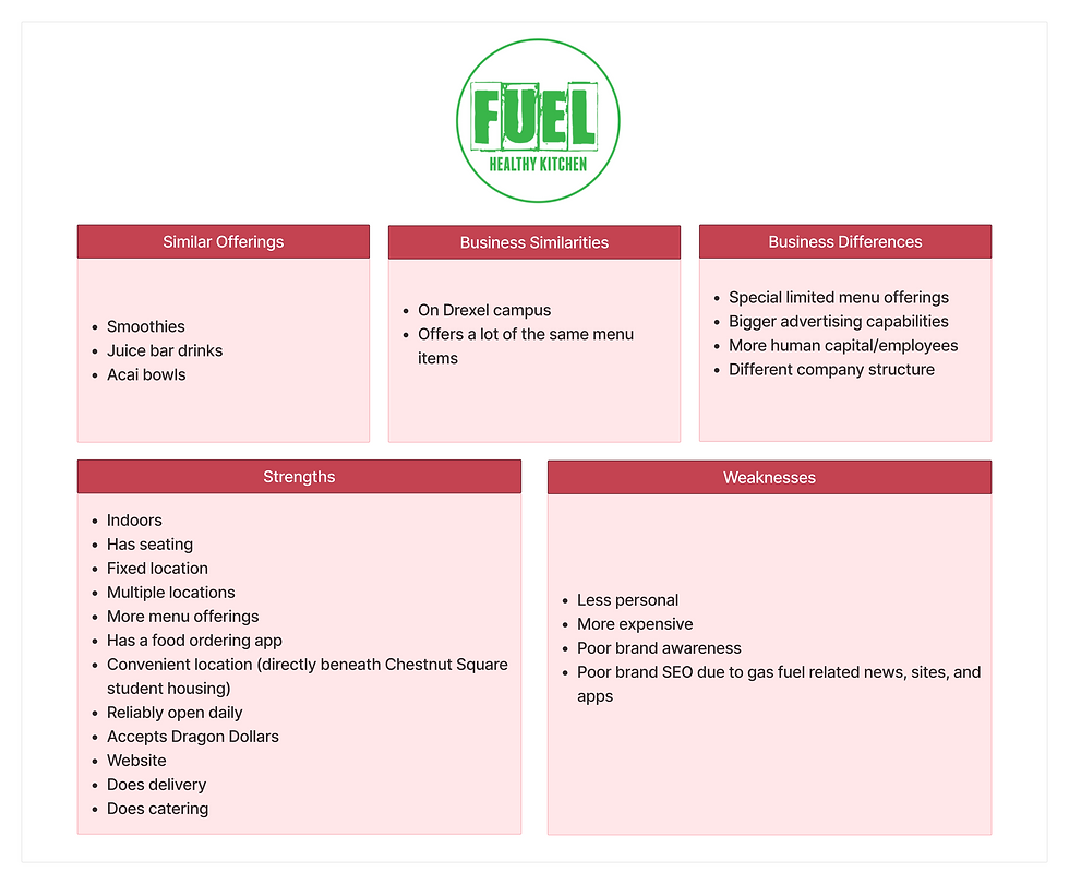
After gaining insights into KC’s business, I analyzed potential competitors, including Wawa, Kung Fu Tea, and Fuel, identifying weaknesses that aligned with KC’s strengths.
We determined that KC’s differentiator was the personal, friendly service she provided, recognizing returning customers and greeting everyone with a smile. While other businesses on campus offered cold beverages, they were all brick and mortar establishments. These differentiating factors shaped our design goals and what we wanted the app to convey.


1/3
KC's Competitor Comparison
Designing Through Iteration
To reflect the joyful interactions we observed at KC's, we set out to create an app with playful microinteractions and a bright, cheerful aesthetic. KC’s warmth was her differentiator, and we wanted the app to carry that same energy. After brainstorming individually, the team collaborated to establish a unified visual direction centered around bright colors, rounded shapes, and fruit imagery.

Moodboard reflecting the joyful interactions at KC's
Low-Fidelity
The first set of designs were grayscale wireframes. Through usability testing, we uncovered several pain points to resolve in future iterations.
Usability testing feedback:
-
Users could not see their order status after they closed the order review screen
-
Tipping preferences varied between users
-
The direction of dropdown chevrons was not intuitive

Low-fidelity designs for the main task flow
Mid-Fidelity
The next set of designs introduced color, icons, and images. Although we had a general vision for how the app should look, our initial mid-fidelity design meeting was slowed by disagreements over color and font choices. To refocus the team, I proposed an action-oriented approach Rather than debating abstract concepts, each member individually experimented within our shared Figma workspace. Visualizing ideas quickly led to more productive discussions, and ultimately, alignment on our visual direction.
Design updates:
-
Added a status bar to the home screen once an order was placed so users could access their order status at any time
-
Introduced "no tip" and "custom tip" options
-
Changed the direction of dropdown chevrons to be more intuitive
Usability testing feedback:
-
Colors did not accurately reflect KC's brand
-
Users did not understand how they would pick up their order at the truck
-
The term "flavors" was misleading

Mid-fidelity designs with updates from low-fidelity testing
High-Fidelity
The final high-fidelity designs addressed the latest feedback from usability testing and introduced a polished flow, complete with microinteractions, for our prototype.
Design updates:
-
Brighter color palette to better reflect KC's brand and convey a cheerful, joyful atmosphere
-
Clarified the order pickup process
-
Changed “flavors” to “ingredients” for clarity

High-fidelity designs with updates from mid-fidelity testing
The Results
In our final round of usability testing, all participants completed the core ordering flow without assistance, validating the simplicity we prioritized from the start. Over three rounds of usability testing with 30 representative users, each iteration surfaced meaningful improvements that shaped the final design. The final prototype received consistent praise for its ease of use, visual design, and moments of delight.
Add to cart animation
"Made me happy"
"Fun animation"
Design
“Very straightforward”
“Cutesy”
“Visually appealing”
Loading screen animation
“Cute and eye-catching”
“A good addition”
Favorite features
“Ease at which it flowed from one task to the next”
“The location and times being at the top”
“How easy it was to order a smoothie”
By grounding every design decision, from the color palette to the checkout flow, in what we observed and heard at the truck, we created a prototype that felt true to KC’s business and provided genuine value for her customers.
Explore my other case studies!

bottom of page